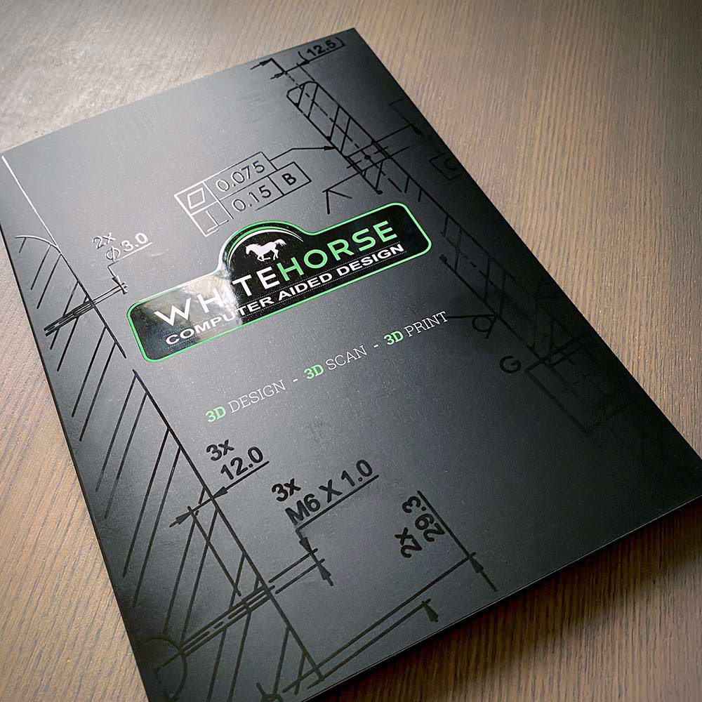
A5 Spot UV Presentation Folder
White Horse CAD
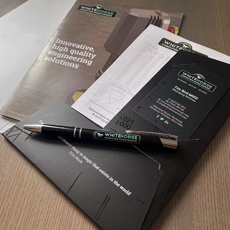
Welcome Pack Contents
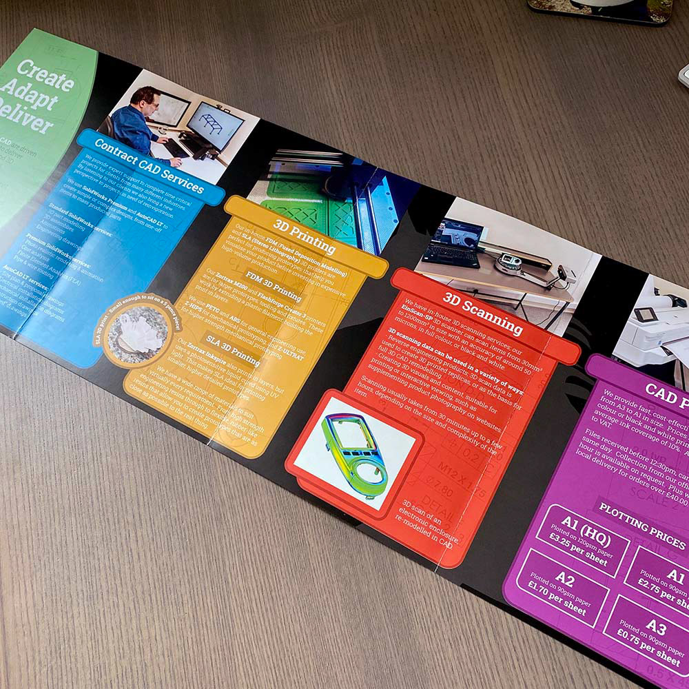
A5 8pp Roll Fold Flyer
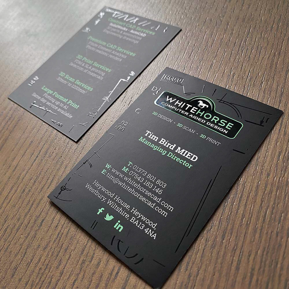
Spot UV Business Cards
White Horse CAD
Print Design & Supply
In 2020 White Horse CAD contacted me to review their existing client and prospect introduction pack after previously supplying them with address labels, branded pens and A6 notepads. Their existing pack consisted of an A5 folder with a flat glued pocket, then filled with 6-8 loose A5 flyers, a business card, pen and notepad; this created the issue of the glued flap being pulled apart and making the folder useless due to too much being packed into it.
Working with the client to evaluate the content of the printed flyers, it was determined that a lot of the information could be summarised without losing too much detail, and we reduced it down to the equivalent of 4 A5 flyers; the individual flyers were then converted to an 8pp A5 roll folded leaflet printed on 170gsm silk to create a wide spread when fully opened out.
The folder itself was completely redesigned; now using an interlocking pocket allowing content up to 7mm thick, this easily accommodated the new leaflet, notepad and pen, and if it accidentally came undone it could be reassembled without wasting the folder.
The folder artwork was also completely overhauled; now featuring only the logo and minimal information printed on a rich black background and matte laminated. A clear gloss spot UV was then applied to the logo print, while one of White Horse CAD's own engineer drawings was supplied and printed in spot UV only, creating a subtle yet high quality finish to the folder when caught in the light.
Lastly, the business cards were redesigned to tie in with the folder design, also featuring the same spot UV effect.
< BACK TO WORK
