
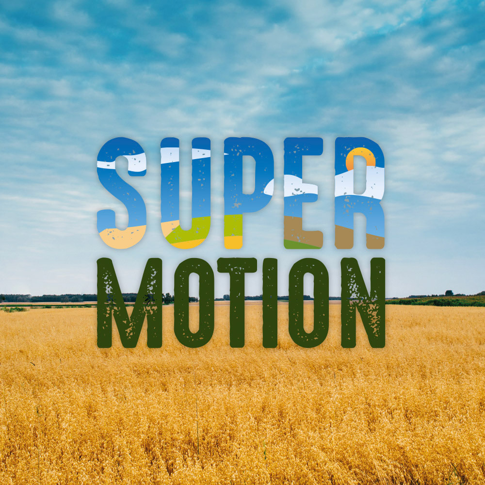
Day Version
Super Motion Logo
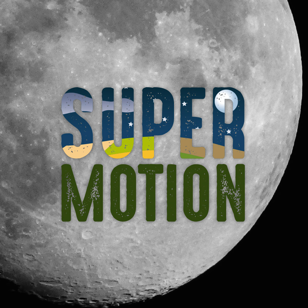
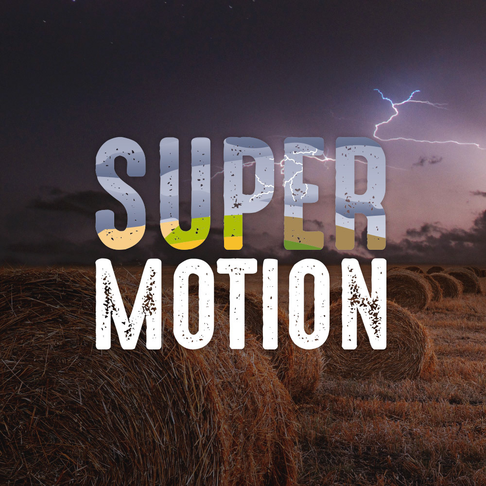
Night Version
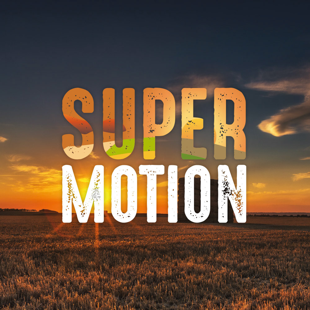
Dawn Version
Storm Version
Super Motion
Logo Design
In 2021 Super Motion, a corporate video production business, commissioned me to design their new logo to communicate their shift of their primary business focus towards producing video for the food and agriculture industry.
The challenge here was to create a logo that conveyed the finished nature and high-end style of Super Motion's videography, so cliche icons and emblems associated with video production (such as "play" symbols, cameras, drones and film cells) had to be avoided, or used in a smart and professional manner.
Focusing more on seeing landscapes in shot, logos were produced to convey this; then through revisions, fonts and graphics with "crisp" edges were eliminated in favour of more eroded lettering masking a farm landscape. Different pallets of colours were trialled, and from one final logo FOUR variants were produced, referred to as "Day", "Night", "Dawn" and "Storm", allowing greater flexibility for Super Motion's branding to compliment the narrative of the video it would be applied to.
With the logo approved, a supporting and extensive brand guideline document was produced and supplied; working further with Super Motion to supply the logo in different formats, an animated version was produced, cycling through the four variants (scroll down for video, shared with permission).